Wind speed. A plot must have an appropriate wind speed, otherwise the amount of energy produced isn't worth the cost of building. The wind speed data we used came from National Renewable Energy Laboratory (NREL) and the data were measured from an instrument height of 50 m . The data was actually per-categorized into a 1-7 range based on wind speed (See Figure 1.) . The data also came in a 200 meter per pixel range and set the standard raster size for all of the other data. Wind power also has one more benefit and that is as wind increases so does the power output at an exponential rate (see Figure 2.) (NREL (2010)). Making a much better option as a energy sources.
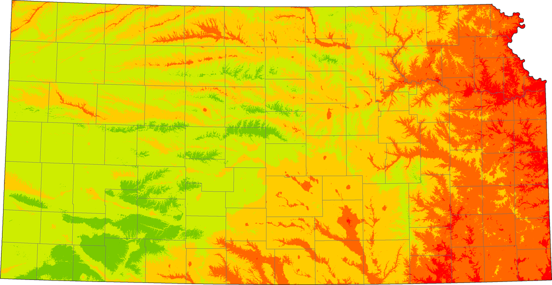
NREL(2010) Wind Speed Data. Red is the Worst and the closer to Green the better
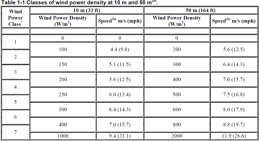
Figure 1. NREL (2010) Wind Power Classification
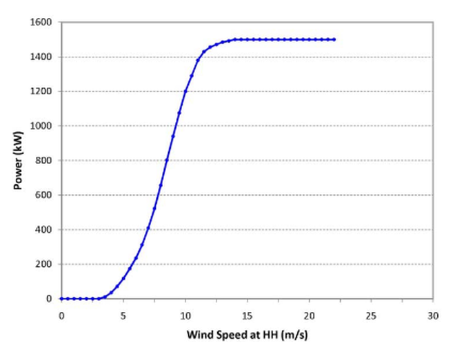
Figure 2. NREL (2009) Power Curve
