We weighted the values of the Data
Layers in order to have certain data have more strength than others. The reason
for this is so that the important features get more say in the value of a cell
I.E. Slope vs. Distance to Railroads. The slope data will have more say because
it's a better attribute than being close to a railroad. How we went about
weighing the data was by taking the standard deviation and the range and
dividing them by each other giving us a percent standard deviation. This was
because the Data Layers with the highest standard deviation was less important
to the total value.
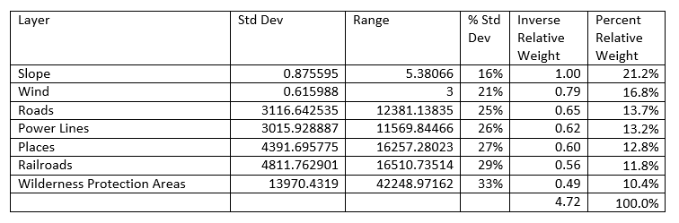
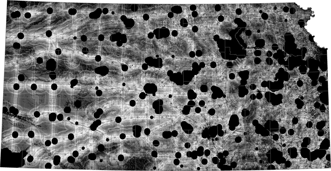
The maps below are Weighted and Equal Weighted.
This map was created by adding the weighted values of all the data layers. Lighter regions have a higher score. Darker regions have a lower score. Black regions have a score of zero. Since slope is the highest weighted factor, scores are higher in western Kansas where the slope is less steep compared to eastern Kansas.
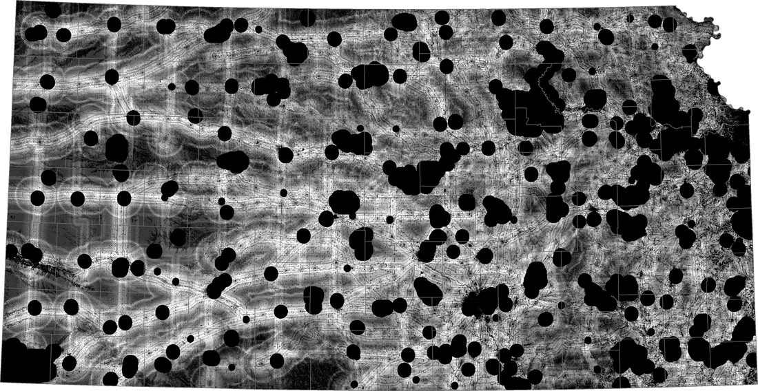
This map was created by adding the values of all of the data layers with no weighting. Again, lighter regions have a higher score. Darker regions have a lower score. Black regions have a score of zero. This map was made to be a comparison to the weighted version shown above. The equal weighting makes the shading more neutral across the state.
